6 Matplotlib Plotting Methods
These methods include:
From 机器之心
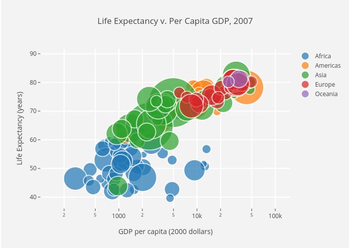
Scatter Plot
Draw scatterplot with scatter.
import matplotlib.pyplot as plt
import numpy as np

def scatterplot(x_data, y_data, x_label="", y_label="", title="", color = "r", yscale_log=False):

    # Create the plot object
    _, ax = plt.subplots()

    # Plot the data, set the size (s), color and transparency (alpha)
    # of the points
    ax.scatter(x_data, y_data, s = 10, color = color, alpha = 0.75)

    if yscale_log == True:
        ax.set_yscale('log')

    # Label the axes and provide a title
    ax.set_title(title)
    ax.set_xlabel(x_label)
    ax.set_ylabel(y_label)
Line Plot
Draw lineplot.
def lineplot(x_data, y_data, x_label="", y_label="", title=""):
    # Create the plot object
    _, ax = plt.subplots()

    # Plot the best fit line, set the linewidth (lw), color and
    # transparency (alpha) of the line
    ax.plot(x_data, y_data, lw = 2, color = '#539caf', alpha = 1)

    # Label the axes and provide a title
    ax.set_title(title)
    ax.set_xlabel(x_label)
    ax.set_ylabel(y_label)
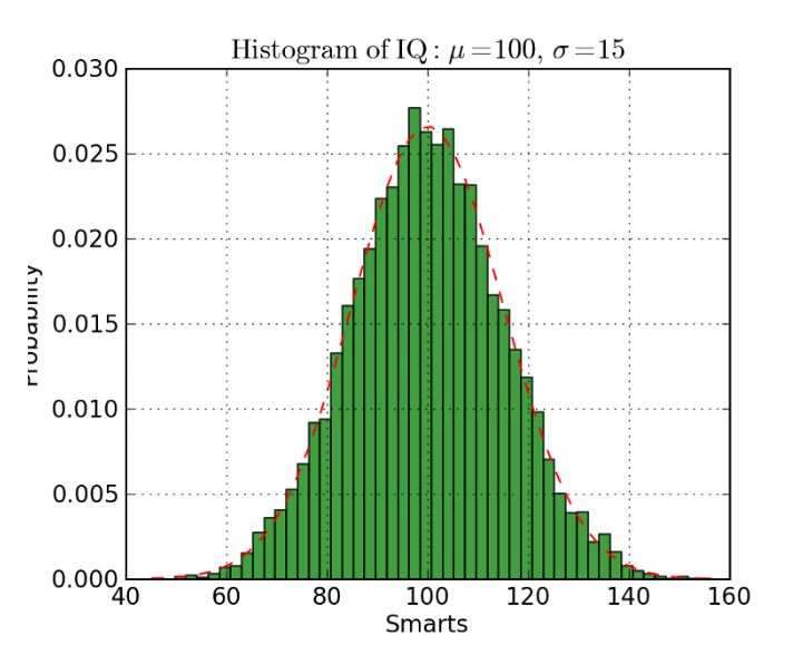
Histogram
Draw histogram.
def histogram(data, n_bins, cumulative=False, x_label = "", y_label = "", title = ""):
    _, ax = plt.subplots()
    ax.hist(data, n_bins = n_bins, cumulative = cumulative, color = '#539caf')
    ax.set_ylabel(y_label)
    ax.set_xlabel(x_label)
    ax.set_title(title)
Overlaid Histogram
Draw overlaid histogram.
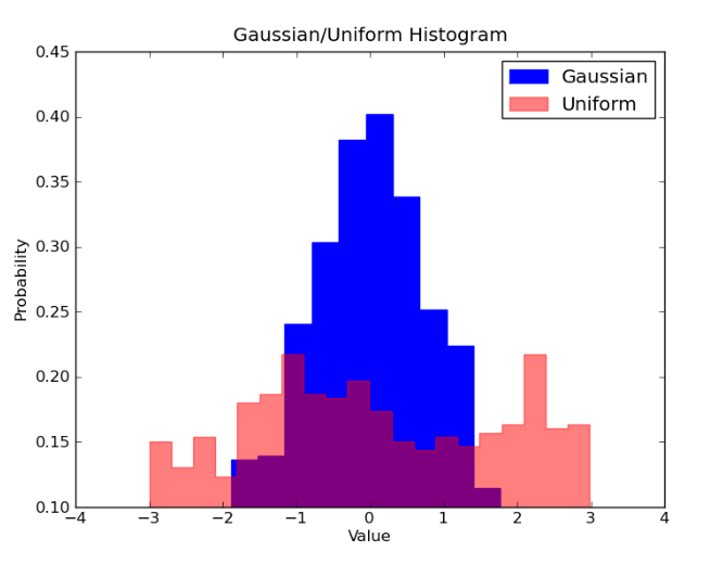
# Overlay 2 histograms to compare them
def overlaid_histogram(data1, data2, n_bins = 0, data1_name="", data1_color="#539caf", data2_name="", data2_color="#7663b0", x_label="", y_label="", title=""):
    # Set the bounds for the bins so that the two distributions are fairly compared
    max_nbins = 10
    data_range = [min(min(data1), min(data2)), max(max(data1), max(data2))]
    binwidth = (data_range[1] - data_range[0]) / max_nbins


    if n_bins == 0
        bins = np.arange(data_range[0], data_range[1] + binwidth, binwidth)
    else:
        bins = n_bins

    # Create the plot
    _, ax = plt.subplots()
    ax.hist(data1, bins = bins, color = data1_color, alpha = 1, label = data1_name)
    ax.hist(data2, bins = bins, color = data2_color, alpha = 0.75, label = data2_name)
    ax.set_ylabel(y_label)
    ax.set_xlabel(x_label)
    ax.set_title(title)
    ax.legend(loc = 'best')
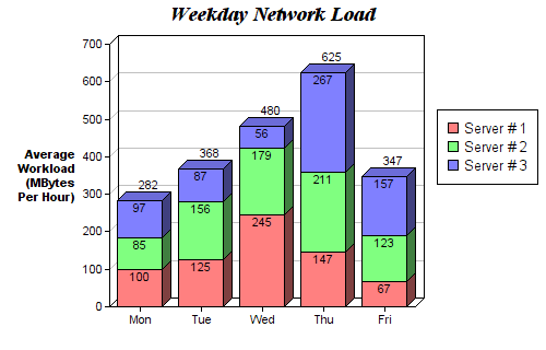
Bar Chart
Draw bar chart
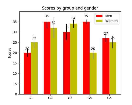
def barplot(x_data, y_data, error_data, x_label="", y_label="", title=""):
    _, ax = plt.subplots()
    # Draw bars, position them in the center of the tick mark on the x-axis
    ax.bar(x_data, y_data, color = '#539caf', align = 'center')
    # Draw error bars to show standard deviation, set ls to 'none'
    # to remove line between points
    ax.errorbar(x_data, y_data, yerr = error_data, color = '#297083', ls = 'none', lw = 2, capthick = 2)
    ax.set_ylabel(y_label)
    ax.set_xlabel(x_label)
    ax.set_title(title)


def stackedbarplot(x_data, y_data_list, colors, y_data_names="", x_label="", y_label="", title=""):
    _, ax = plt.subplots()
    # Draw bars, one category at a time
    for i in range(0, len(y_data_list)):
        if i == 0:
            ax.bar(x_data, y_data_list[i], color = colors[i], align = 'center', label = y_data_names[i])
        else:
            # For each category after the first, the bottom of the
            # bar will be the top of the last category
            ax.bar(x_data, y_data_list[i], color = colors[i], bottom = y_data_list[i - 1], align = 'center', label = y_data_names[i])
    ax.set_ylabel(y_label)
    ax.set_xlabel(x_label)
    ax.set_title(title)
    ax.legend(loc = 'upper right')


def groupedbarplot(x_data, y_data_list, colors, y_data_names="", x_label="", y_label="", title=""):
    _, ax = plt.subplots()
    # Total width for all bars at one x location
    total_width = 0.8
    # Width of each individual bar
    ind_width = total_width / len(y_data_list)
    # This centers each cluster of bars about the x tick mark
    alteration = np.arange(-(total_width/2), total_width/2, ind_width)


    # Draw bars, one category at a time
    for i in range(0, len(y_data_list)):
        # Move the bar to the right on the x-axis so it doesn't
        # overlap with previously drawn ones
        ax.bar(x_data + alteration[i], y_data_list[i], color = colors[i], label = y_data_names[i], width = ind_width)
    ax.set_ylabel(y_label)
    ax.set_xlabel(x_label)
    ax.set_title(title)
    ax.legend(loc = 'upper right')
Box Plot
Draw boxplot.
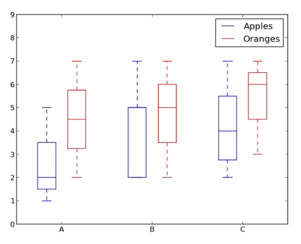
箱线图实线箱的底部表示第一个四分位数,顶部表示第三个四分位数,箱内的线表示第二个四分位数(中位数)。虚线表示数据的分布范围。
由于箱线图是对单个变量的可视化,其设置很简单。x_data 是变量的列表。Matplotlib 函数 boxplot() 为 y_data 的每一列或 y_data 序列中的每个向量绘制一个箱线图,因此 x_data 中的每个值对应 y_data 中的一列/一个向量。
def boxplot(x_data, y_data, base_color="#539caf", median_color="#297083", x_label="", y_label="", title=""):
    _, ax = plt.subplots()

    # Draw boxplots, specifying desired style
    ax.boxplot(y_data
               # patch_artist must be True to control box fill
               , patch_artist = True
               # Properties of median line
               , medianprops = {'color': median_color}
               # Properties of box
               , boxprops = {'color': base_color, 'facecolor': base_color}
               # Properties of whiskers
               , whiskerprops = {'color': base_color}
               # Properties of whisker caps
               , capprops = {'color': base_color})

    # By default, the tick label starts at 1 and increments by 1 for
    # each box drawn. This sets the labels to the ones we want
    ax.set_xticklabels(x_data)
    ax.set_ylabel(y_label)
    ax.set_xlabel(x_label)
    ax.set_title(title)