4 More Quick and Easy Data Visualizations
These methods include:
From Twards Data Science
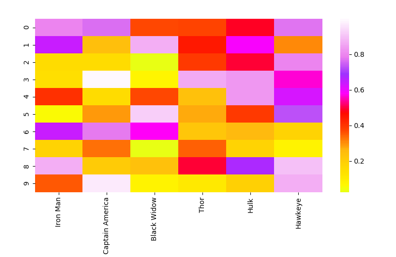
Heat Map
A heat map is a matrix representation of data where each matrix value is represented as a colour. The different colours represent different magnitudes and the matrix indices link together the 2 items or features being compared. Heat maps are great for showing the relationships between multiple feature variables since you can directly see the magnitude as a colour. You can also see how each relationship compares to the other relationships in your dataset by looking at the other points in the heat map. The colour is really what provides the easy interpretation since it is so intuitive.
# Importing libs
import seaborn as sns
import pandas as pd
import numpy as np
import matplotlib.pyplot as plt

# Create a random dataset
data = pd.DataFrame(np.random.random((10,6)), columns=["Iron Man","Captain America","Black Widow","Thor","Hulk", "Hawkeye"])

print(data)

# Plot the heatmap
heatmap_plot = sns.heatmap(data, center=0, cmap='gist_ncar')

plt.show()
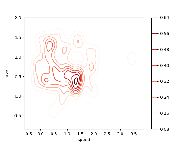
2D Density Plot
A 2D density plot is a simple extension of the 1D version with the added benefit of being able to see the probability distribution with respect to 2 variables. Let’s checkout the 2D density plot below. The legend on the right uses colour to represent the probability at each point. The highest probability, and therefore concentration of our data, seems to be around a size of 0.5 and a speed of 1.4-ish. As you can tell by now, 2D density plots are great for quickly identifying where our data is most concentrated with respect to two variables, rather than just one as in the 1D density plot. This is especially powerful when you have two variables that are very important to your output and want to see how they both contribute together to the output distribution.
# Importing libs
import seaborn as sns
import matplotlib.pyplot as plt
from scipy.stats import skewnorm

# Create the data
speed = skewnorm.rvs(4, size=50)
size = skewnorm.rvs(4, size=50)

# Create and shor the 2D Density plot
ax = sns.kdeplot(speed, size, cmap="Reds", shade=False, bw=.15, cbar=True)
ax.set(xlabel='speed', ylabel='size')
plt.show()
Spider Plot
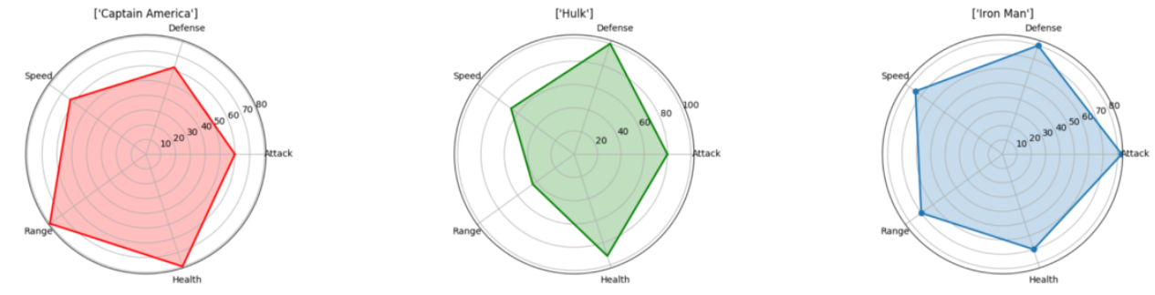
A spider plot is one of the best ways to display a one-to-many relationship. I.e you can plot and see the values of several variables with respect to a single variable or category. The prominence of one variable over another is clear and obvious in a spider plot since the area and length is made larger in that specific direction. If you want to see how several categories stack up with respect to those variables, you can plot them side by side. In the diagram below, it’s easy to compare the different attributes of the avengers and see where each of their strengths lie! (Note that these stats were set pretty randomly, I wasn’t biased to any of the Avengers ;) )
# Import libs
import pandas as pd
import seaborn as sns
import numpy as np
import matplotlib.pyplot as plt

# Get the data
df=pd.read_csv("avengers_data.csv")
print(df)

"""
   #             Name  Attack  Defense  Speed  Range  Health
0  1         Iron Man      83       80     75     70      70
1  2  Captain America      60       62     63     80      80
2  3             Thor      80       82     83    100     100
3  3             Hulk      80      100     67     44      92
4  4      Black Widow      52       43     60     50      65
5  5          Hawkeye      58       64     58     80      65
"""

# Get the data for Iron Man
labels=np.array(["Attack","Defense","Speed","Range","Health"])
stats=df.loc[0,labels].values

# Make some calculations for the plot
angles=np.linspace(0, 2*np.pi, len(labels), endpoint=False)
stats=np.concatenate((stats,[stats[0]]))
angles=np.concatenate((angles,[angles[0]]))

# Plot stuff
fig = plt.figure()
ax = fig.add_subplot(111, polar=True)
ax.plot(angles, stats, 'o-', linewidth=2)
ax.fill(angles, stats, alpha=0.25)
ax.set_thetagrids(angles * 180/np.pi, labels)
ax.set_title([df.loc[0,"Name"]])
ax.grid(True)

plt.show()
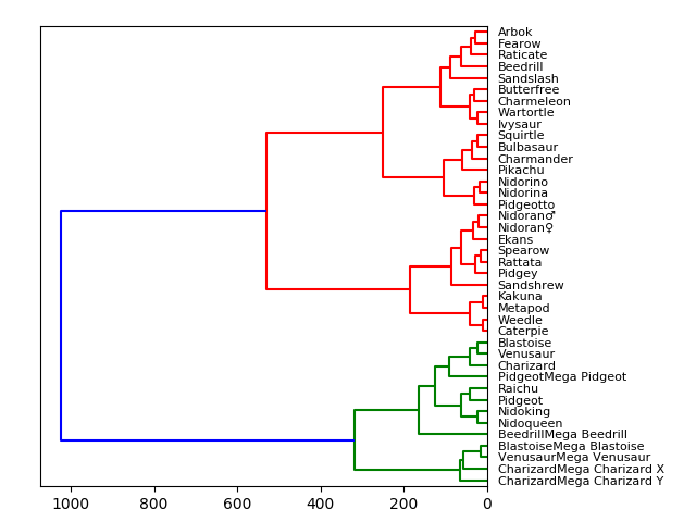
Tree Diagram
We’ve been using tree diagrams since grade school! They’re natural and intuitive which makes them easy to interpret. Nodes which have a direct connection have a close relationship whereas node which are many connections apart aren’t very similar. In the visualisation below I’ve plotted a small chunk of the Pokemon with stats dataset from Kaggle according to their stats:
HP, Attack, Defense, Special Attack, Special Defense, Speed
Therefore, the Pokemon that are most evenly matched stats wise will be closely connected together. For example, we see that at the top, Arbok and Fearow are directly connected and if we check the data, Arbok has a total of 438 while Fearow has 442, very close! But once we move to Raticate we get a total value of 413 which is quite different from Arbok and Fearow, hence why they are separated! As we move up the tree, the Pokemon are grouped more and more based on similarity. Pokemon in the green group are more similar to each other than they are to anything in the red group, even if there is no direct green connection.
# Import libs
import pandas as pd
from matplotlib import pyplot as plt
from scipy.cluster import hierarchy
import numpy as np

# Read in the dataset
# Drop any fields that are strings
# Only get the first 40 because this dataset is big
df = pd.read_csv('Pokemon.csv')
df = df.set_index('Name')
del df.index.name
df = df.drop(["Type 1", "Type 2", "Legendary"], axis=1)
df = df.head(n=40)

# Calculate the distance between each sample
Z = hierarchy.linkage(df, 'ward')

# Orientation our tree
hierarchy.dendrogram(Z, orientation="left", labels=df.index)

plt.show()
For a tree diagram we’re actually going to use Scipy! After reading in our dataset we’ll get rid of the string columns. We do this here simply to get right to our visualising but in practice it’d be great to convert those strings to categorical variables for better comparison and results. We also set the data frame index so that we can properly use it as the column by which to reference each node. Finally, computing and plotting the tree is a simple one-liner in Scipy!